Identity / Typography
SeolLab Identity
SeolLab's visual language connects technical records and outcomes. Explore logo and typography guidelines.
로고
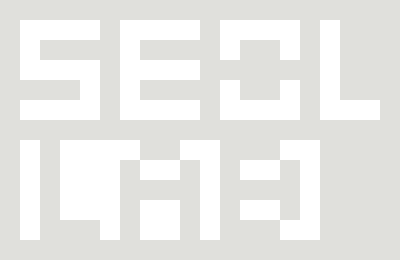
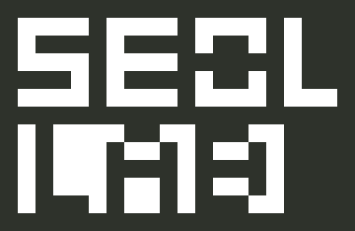
SeolLab 로고는 글자가 투명하게 뚫린 직사각형 판입니다. 20:13 비율을 유지하며, 어두운 배경에는 흰색 판의 반전형, 밝은 배경에는 검은색 판의 기본형을 사용합니다. 글자만 남기거나 판의 모서리·비율을 바꾸지 않습니다.
최소 크기와 보호 여백의 수치 규격은 추후 확정합니다.
사용 서체
Inter는 큰 영문 제목과 핵심 메시지에 사용하는 기본 서체입니다. 가독성과 안정적인 인상을 우선하고, 한글 제목은 Pretendard로 조합합니다.
Pretendard는 한글·영문 본문과 메뉴·버튼·푸터에 사용하는 읽기·조작용 서체입니다. 메뉴는 중간 굵기, 본문은 기본 굵기로 구분해 글자를 확대해도 균형을 유지합니다. 공식 Pretendard Variable 1.3.9의 가변 동적 서브셋을 자체 호스팅하며, SIL Open Font License 1.1을 제공합니다.
Tektur는 명함에서 이어지는 보조 브랜드 서체입니다. 작은 영문 기술 라벨, 섹션 구분 문구, 장식용 숫자에 제한하며 큰 제목이나 본문에는 사용하지 않습니다. 소스 코드와 수치 정렬에는 고정폭 서체를 사용합니다. 로고는 확정 SVG를 사용하며 서체로 대체하지 않습니다.
서체는 SIL Open Font License 1.1에 따라 자체 호스팅합니다.
PRIMARY TYPEFACE / INTER
Understand.
Build with clarity.
Large headings and key messages use calm sans-serif typography: Inter for English and Pretendard for Korean.
Inter · SIL Open Font License 1.1READING & UI / PRETENDARD
Clear technology. Readable records.
Engineering with clarity.
Pretendard balances Korean and English in navigation, buttons, body text and footers. Medium-weight navigation and regular body text maintain a calm appearance at larger sizes.
Pretendard · SIL Open Font License 1.1ACCENT TYPEFACE / TEKTUR
Small English labels and decorative numbers carry the brand's character from its business cards. Tektur is not used for large headings or body text. Code uses a monospace typeface.
Tektur · SIL Open Font License 1.1